Individual Facebook Like Buttons for Images with NextGEN Gallery

Because I think this is probably of interest to some people but I don’t have a lot of ambition to write about it, I will present these instructions as concisely as possible:

  1. Have a WordPress website up and running
  2. Install the NextGen Gallery plugin
  3. Install FancyBox the old fashioned way or as a plugin
  4. Read this post about Facebook Open Graph WordPress Integration to learn about adding proper Open Graph meta elements to the header of your site.
  5. From your WordPress admin pages go to Gallery > Options > Effects
    1. JavaScript Thumbnail Effect: Custom
    2. Link code line: rel=”gallery”
  6. Then go to Gallery > Options > General Options
    1. Activate Permalinks: YES and define a slug.
  7. Then go to Gallery > Options > Gallery
    1. Show ImageBrowser: YES

The trick with getting NextGEN Gallery to both display your image galleries large images as FancyBox overlays and create unique pages with URLs to display each individual image is to enable the ImageBrowser mode but then alter NextGEN Gallery.php template so that the FancyBox (or other overlay solution) code is used regardless of the “Show ImageBrowser” setting.

With the above settings in place, backup a copy of the NextGEN gallery plugin files from your web server.

/wp-content/plugins/nextgen-gallery/

Then navigate to following file and open it with your favorite text editor.

[YourDesktop or wherever]/nextgen-gallery/view/gallery.php

Scroll down to the part where it says “Thumbnails” in comments. This is the loop that outputs the thumbnail grid that displays your embedded NGG gallery on the page. Find the line below:

<a href="<?php echo $image->imageURL ?>" title="<?php echo $image->description ?>"
<?php echo $image->thumbcode ?> >

and change it to:

<a href="<?php echo $image->imageURL ?>" title="&lt;div style=&quot;float:left;
width:70px;&quot;&gt;&lt;iframe src=&quot;http://www.facebook.com/plugins/like.php?
app_id=YOUAPPIDNUMBERHERE&amp;amp;href=<?php echo urlencode(get_permalink()) ?>%2F
YOURGALLERYSLUGHERE%2Fimage%2F<?php echo urlencode($image->image_slug) ?>&amp;amp;
send=false&amp;amp;layout=box_count&amp;amp;width=50&amp;amp;show_faces=true&amp;amp;
action=like&amp;amp;colorscheme=light&amp;amp;font&amp;amp;height=60&quot; scrolling=
&quot;no&quot; frameborder=&quot;0&quot; style=&quot;border:none; overflow:hidden;
width:70px; height:60px;&quot; allowTransparency=&quot;true&quot;&gt;&lt;/iframe&gt;
&lt;/div&gt;" <?php echo $image->thumbcode ?>  rel="gallery">

Save gallery.php and upload to your webserver. If you have the OpenGraph meta elements in place you should now be able to navigate to a NextGEN Gallery on your site, click on a thumbnail and see something like this (right):

This is an individual Like button, allowing your visitors to “Like” specific images within a gallery. Now, it doesn’t work perfectly. Even though you are linking the Like button to a URL that is specific to that image, in my experience Facebook still grabs the first image from that gallery for the thumbnail displayed on the individual’s Facebook Wall. And it seems like the link from Facebook will take visitors to the gallery page of the specific image. Again, this is odd and shouldn’t be, but Facebook is doing a lot of magic here, so who knows why it isn’t working perfectly. The important thing is:

  1. Your visitors can Like individual images.
  2. If visitors see a link to your image on Facebook, clicking the link will take them to the gallery that contains the image in question.

If you get this successfully working to fulfill your needs, be sure to keep a backup of your gallery.php file. Every time the NextGen Gallery plugin is updated this file will most likely get overwritten.

Make WordPress Admin Bar a Sidebar

Fig. 1: Default WordPress Admin Bar

At least since WordPress released version 3 of its open source website CMS it has included a new feature called the “Admin Bar”. This Admin Bar is a menu bar displayed at the top of your WordPress site’s public-facing pages when you are logged in to your site. It is a handy way to move back-and-forth between your public pages and your site administration pages. (see fig. 1)

Sometimes this isn’t a good solution. Especially if the navigation on the public site is at the top of the page with fixed positioning. In that case the admin bar lays over the site’s actual navigation, making impossible to use while logged in.

Fig. 2: Example of Admin Bar as a Sidebar

I haven’t seen a lot of discussion online about how to customize this without installing another plugin. After attempting some tweaks by manipulating the CSS with Firebug it became apparent that this Admin Bar could easily be styled by simply adding CSS rules that apply to the end of your theme’s stylesheet.

On a recent project I developed some CSS style rules to add to your site theme’s style.css file. These styles will transform the long, horizontal admin bar into tall sidebar. This probably won’t work for a 1024px-wide screen, but for many widescreen laptops and displays this should work well.

It still has the default WordPress admin look so I figured this little bit of CSS might be helpful to others. Below is the CSS that I used to make the Admin Bar appear as it does in fig. 2.

/* WordPress Admin Bar Styles */
div#wpadminbar {
    width:120px;
    min-width:120px;
    height:100%;
    background:url('/wp-admin/images/menu-shadow.png') repeat-y top right #737373;
    border-right:solid 1px #999;
}
div#wpadminbar ul li {
    width:100%;
}
div#wpadminbar .quicklinks > ul > li > a {
    border-width:0 0 1px 0;
}
div#wpadminbar .quicklinks li#wp-admin-bar-my-account-with-avatar ul,
div#wpadminbar ul li.menupop ul {
    z-index:1000;
    margin-top:-28px;
    left:114px;
}
#wpadminbar .quicklinks .menupop ul {
    border-top:1px solid #DFDFDF;
}
div#wpadminbar div#adminbarsearch-wrap {
    display:none;
}

I make no guarantees, but do let me know if this worked for you or if you see any problem areas.

What’s Wrong With Gnome 3?

Just read and commented on Ars Technica’s review of Gnome 3, the latest release of the Gnome desktop environment for Linux. It was a long enough comment that I wanted to republish it here:

The worst thing I see, because the available screen typeface discussion is off-topic, is by the active application’s name in the top-left. That presentation of the application’s icon by the name is distracting and not helpful. The top bar is supposed to recede, but including the app icon there breaks with that goal. It would have looked much cleaner to replace “Activities” with the Gnome icon (or ubuntu logo or take your pic) and simply present the name of the application.

I prefer Unity’s approach in that regard except for the idiotic window-close-minimize-buttons being squashed into the main menu bar. That is awkward and I think they’ll find a lot of people, trying to click on the Ubuntu icon in the top-left, accidentally closing their application window. But we’ll see.

My other big gripe is the prominence and amount of work that has gone into workspaces/multiple desktops. Gnome claims that this system is focused on simplicity, but most users I know struggle to get their mind around using ONE desktop/workspace. The multiple workspace feature is purely for advanced users. It’s way too abstract of a concept for the basic user. I consider myself a VERY advanced user and workspaces are the first thing I turn off on a new Linux install. I am much better at organizing my workflow in terms of applications. Trying to break those applications up over workspaces is redundant and I don’t care where the window is if I can summon it when I need it and hide/minimize it when I’m working on something else.

They should be working harder to make workflow/task management even MORE organic. It should be so organic that I don’t have to be thinking about how to organize it. Right now I get along great with a basic Ubuntu install, simple keybinding to summon the Scale function (Expose) to switch between documents, Alt+Tab to quickly switch apps and Docky to open/switch apps. I think the problem is that Linux developers think in terms of Window management when they should be thinking about Application and Workflow management.

Supposedly these new desktop interface designs have been run by test groups, but I’m a little skeptical. With that said, there are a LOT of good and cool ideas in both Gnome 3 and Unity. When in doubt, try many things. And seeing these ideas being developed is refreshing. Neither Microsoft or Apple is attempting to make such dramatic changes to the way their desktop interfaces work.

One More Thought

After publishing the above comment it also occurred to me that the new Gnome desktop defines a specific functionality to the “Windows” key on most keyboards. I have been using my Windows key to summon a third-level (and fourth) keyboard to make it easy to enter larger group and “special characters”. [I wrote about this in detail here] It baffles me that making third and fourth levels of keyboard characters is not a bigger priority. This is a MAJOR advantage that Apple has over Microsoft in the world of desktop publishing. Every graphic designer knows it. And people like me that find Linux to be a good and soon to be great graphics platform would like to see some focus on these details.

I need to make time to get involved with the Gnome development community. I need to get in there and push for better keyboard functionality and, more importantly, better integration of color management. Granted, both of these area DO get a lot of love. It’s just that they have to be implemented manually. Neither of these two features are addressed by default installs of the major Linux distributions.

Do take a moment to check out the Gnome 3 features: http://www.gnome.org/gnome-3/ There’s still a lot of cool stuff coming to a Linux desktop near you.

20 Years of Linux

This video doesn’t have a lot of detail, but it’s a good review of the basic history. I’m only on my sixth or seventh year of using Linux myself. I can only imagine that if Wayne’s World 2 would have come out in 1996, instead of 1993, Garth’s soon-to-be girlfriend would probably have been reading a book on Linux rather than UNIX. But you might disagree with me on that.

The Basics of Using ZIP Archives

It’s recently come to my attention that the general public has never heard of .zip or any other type of compressed archive. The idea of a compressed archive has been around for many many years. It certainly was a very early part of computer science. This article is intended to help regular people understand why these types of files are useful and how to use them on a very basic level in Windows, Mac OSX and Linux.

This post is not a detailed review of the various types of archive file formats or how they compare to each other. I am talking about .zip because, like the MP3 file format for compressed music, regardless of it being superseded by newer and better technologies it is the most common type of file archive in use today.

What the hell is a ZIP archive?

Archive files, at their most basic, are something like the boxes we put things into for shipping them to other locations. You would never simply write a mailing address on the cover of a book or box of chocolates and drop them in the mail. At the very least you’d wrap them in some tough, opaque brown paper. For something that is soft or fragile you would probably put them in a big brown cardboard box with bubble wrap to protect them on their journey. Of course, you might not be shipping the item at all. You might simply want to put it in a box for safe, organized storage.

For basic purposes all of these uses of a cardboard box are a perfect analogy to an archive file.

Sounds simple. How do I create a ZIP archive?

When it comes to desktop/laptop computers or any computer with a screen, mouse and keyboard there are several different operating systems. In terms of dealing with ZIP archives, however, there’s pretty much only two categories:

  1. Some version of the Windows operating system
  2. Some version or type of UNIX-like operating system
    • Apple Mac OSX
    • UNIX (BSD, Solaris, etc.)
    • Linux (Ubuntu, Fedora, Suse, etc.)

I am making this grand over-simplification because basically every UNIX-like operating system for desktop/laptop use includes software for creating and manipulating .ZIP archives as well as other archive types. Winblows, I mean “Windows,” in my experience never comes with this type of software pre-installed. Okay, maybe sometimes it comes with a free trial version of WinZip, but I find that beginners don’t really understand how to use WinZip. It’s definitely more geared towards advanced users.

Okay okay, but HOW DO I CREATE A ZIP ARCHIVE?

Don’t like my snarky comments about Windows, eh? Fine . . .

In order to bring Windows up to par with other computers you can install the free-and-open-source 7zip application. Go to http://www.7-zip.org and click on the top-most “Download” link to download the 7zip installer for Windows. Run the installer. Once installed continue reading.

Creating a ZIP Archive

  1. On your desktop create a new folder called “brownbox” (or whatever you want, there’s nothing magical about the title “brownbox”).
  2. Copy some photos or word processor files to this folder.
  3. Right-click on the folder and, from the resulting menu select one of the following:
    • Windows + 7zip: “Add to archive . . .”
    • Mac OSX: “Create Archive of . . . ”
      Note: If right-click is not enabled on your system you can click-and-hold or press the Control/Ctrl key + mouseclick to access the contextual menu.
    • UNIX/Linux: “Compress”
  4. An archive should be created on the desktop with the same name as your folder. Windows + 7zip and UNIX/Linux will probably ask you where you would like to save the archive while OSX automatically saves it to the same location as the original folder.

Opening a ZIP Archive

I’m using the term “open” pretty loosely here. I think that the general public, wanting to access the contents of an archive file, will most likely want to “Extract” or “Decompress” the contents of the archive into a standard “folder” on their desktop. To do that:

  1. Ask your archive software to extract/decompress the contents of the archive like this:
    • Windows + 7zip: Right-click and click “Extract here”
    • Mac OSX: Double-click on the archive
    • UNIX/Linux: Right-click and click “Extract here”

Again, OSX will automatically save the extracted files to the same location as the original file while Windows + 7zip and UNIX/Linux will generally present a Save As dialog.

So archive files aren’t just for nerds!

Exactly. Let me know if you have any questions.

Great New Book Coming Soon: “Design for Hackers”

Please consider signing up for email updates for this great new book that is intended to help “hackers” learn the basics of design. It’s being written by a very skillful (and good-looking!) designer named David Kadavy. The book will be available September 2011 and the publisher, Wiley, has recently made the book’s website live: designforhackers.com.

The cover design looks AWESOME.

HP LaserJet CP1525nw and Linux

Just bought a new HP LaserJet CP1525nw color laser printer for my home office. My wife and I have been making due for many years with an ancient HP inkjet printer that I had got second hand. Went it comes to needing something nice printed we relied on going to Kinkos or wherever. However, even small jobs end up taking more than 30 minutes at those places, so I finally decided that we needed to upgrade. And I wanted a laser printer because of the output quality and the more-practical toner cartridges as opposed to the unreliable and low-output ink cartridges.

You have to be a bit more selective when shopping for a printer when you are running Linux. But HP provides good drivers for their printers on Linux, so I looked at their offerings and found a too-good-to-be-true color pinter priced at $200 on sale at a local office supply store. I had originally planned on getting a black-only laser printer to avoid the high-cost of color laser printers, but prices have come down considerable since I last looked a few years ago. And the concept of a small printer that is network-ready is altogether new to me, but a great feature and one that lends printers to be more and more independent of any given operating system.

The HP LaserJet CP1525nw has turned out to be a very good choice for any home/office set up, but especially one running Linux. The HP packaging certainly doesn’t make it apparent that this machine will work with Linux, but it does just fine. Below I will provide a few pointers on getting this printer up and running on your home network.

The minimal printed documentation that comes with the printer is a joke. It basically instructs you how to plug your printer into the wall, then to your computer or router and then, with an illustration, how to put the provided CD/DVD into your computer’s optical drive. It’s ridiculous. No surprise the software auto-setup is only provided for Windows and Mac OSX. Fortunately, the setup is completely unnecessary.

The No-Bullshit Way To Setup Your HP CP1525nw For Wireless Printing

  1. Unpack the printer, remove the tape and stuff and plug it into a power outlet. Check the built-in LCD monitor and wait for the printer to complete its self-setup.
  2. Connect the printer to your router via ethernet cable.
  3. At this point you might need to navigate via the LCD and printer buttons to the Network setup. It’s a simple menu tree that you navigate via clicking the arrow buttons and clicking OK. Just connect via Ethernet and use DHCP. It should connect itself to your network.
  4. Once the printer connects to your network it will display its IP address on the printer’s built-in LCD screen.
  5. Enter that IP address into a web browser on a computer that is on the same network. After you click enter you will be presented with a web-based administration interface for your printer.

  6. Click on the “Networking” tab.
  7. Click on “Wireless Configuration” on the left-hand options.
  8. Status should be “ON”
    Configuration Method should be “Join an existing network”.
    Network Name should present a list of available networks. Click on yours.
    Authentication should be set according to your network
  9. Click APPLY and disconnect the wired connection to the router. The little wireless light on the front of the printer will start blinking as it connects to your router wirelessly. Once the light is solid the printer’s new IP address should be displayed on the built-in LCD display.
  10. On your computer try adding the network-available printer. There is lots of documentation out there to do this for the most popular Linux distributions. I won’t repeat those instructions here. The HP Linux driver that’s currently available does not specifically include support for this model, but just look for the latest HP CP15XX model number and it will work fine.

That should be it. You should be able to run test prints and confirm that your printing settings are all correct. Hopefully this is helpful.

Addendum

If you like to pinch pennies like me, you probably turn off your printer when it’s sitting idle for long periods of time. I discovered that, using the DHCP mode, sometimes the printer would get a different IP address. This might not be a problem for some networks, but for me it would cause my Ubuntu desktops to automatically add a new printer at that different IP address.

To resolve this issue all you have to do is:

  1. Set a Fixed IP Address
    If you know that your two or five computers on the network are relatively low in the IP range, pick an IP address for the printer that will most likely not interfere with other systems. Something like 192.168.1.50 would probably work. Regardless, decide on a number for the printer.
  2. Configure the Printer’s IP Address
    From the on-printer LCD screen and simple navigation button, go to
    Network Setup > TCP/IP Config > Manual
    You can set the IP address with the left-right arrow and the OK button.

With that set up, your printer should be able to reconnect to the wireless network and every time you turn the printer off and on it will always have the same IP address.

Set a Custom Starting Point for a YouTube Video

I’ve been embedding videos from a variety of services into web pages for several years now. At the most basic, these services will allow you to embed a smaller version of the parent video. YouTube gives you the ability to adjust the display size and video player color scheme as well as some other interface options. Hulu is unique (as far as I know) in providing users with an easy-to-use custom clipping interface, allowing you to embed only a part of a selected video. I’ve gotten so comfortable with that feature that I’ve been hoping YouTube would introduce something similar.

Well, there’s good news. It’s not as slick as Hulu, but YouTube does provide some options on their embedded player. Most importantly there’s an option to specify a custom starting point for any embedded video. Here’s the parameter:

start

You can use this parameter by adding it to the source URLs in the provided embed code. For example, if I wanted to start my embedded video at the 1:12 mark, the YouTube embed code would look like this:


<object width="656" height="517"><param name="movie" value="http://www.youtube.com/v/tqXJzZ_T8kg?fs=1&amp;hl=en_US&amp;rel=0&amp;start=72"></param><param name="allowFullScreen" value="true"></param><param name="allowscriptaccess" value="always"></param><embed src="http://www.youtube.com/v/tqXJzZ_T8kg?fs=1&amp;hl=en_US&amp;rel=0&amp;start=72" type="application/x-shockwave-flash" allowscriptaccess="always" allowfullscreen="true" width="656" height="517"></embed></object>

And the result will be the following:

You’re welcome!

Why GIMP Is NOT Inadequate

Troy Sobotka, who appears to be a very accomplished commercial artist working in video, illustration and photography, made a relatively brief list of problem areas for Gimp on his blog: http://troy-sobotka.blogspot.com/2011/01/why-gimp-is-inadequate.html

He makes some good points, but the last half of his post is a lot of alarmist speculation. The obvious answer to improving Gimp is to contribute to its development. Complaints about difficult developers sounds like a bunch of complaining. With any open source project you have to earn the respect of the senior developers through consistent work, usually the not-so-exciting kind. With any open source project there are more users than developers and certainly more users suggesting ideas than making any attempt to squash bugs, write documentation or provide objective and helpful feedback. Opinions and assholes.

Anyway, I left a LONG comment today and wanted to duplicate that comment here. The only thing I should have added is a need for Gimp to continue improving color management and that’s why I just said it. Anyway, here’s my comment:

I’m a professional graphic designer. I use Photoshop and Gimp at a very high level of proficiency. Just to point out where I’m coming from. I like Pshop and Gimp for their different strengths, but some of the above arguments are wrong. Gimp certainly has room for improvement, but anyone that actually used Photoshop in 1996 knows that Pshop itself has come a LONG way in 15 years.

I would like to point out something that needs to be understood about the importance of bit-depth. I am constantly working with hi-res jpegs from a wide variety of professional photographers every day. You know how many of those files use 32 bits/channel? None. You know how many of those files use 16 bits/channel? None. They are ALL in 8 bits/channel. It’s certainly great to have the higher bit-depth options, but the importance of that capability in terms of graphic design/manipulating images for press is greatly exaggerated.

Also, CMYK color space in Photoshop is misused by graphic designers because most of them know very little about color space and/or color management. Some of us know (I don’t mean to offend anyone) but the majority of designers I have worked with are completely oblivious. I’ve even seen creative directors explicitly instruct their designers to select “discard color profile” when confronted with the “What should I do?” dialog in Photoshop. The need for CMYK color space, though useful and great, is also greatly exaggerated.

I also think the complaints about the UX are very subjective and usually only illustrate how little effort the commenter put into learning about and using the Gimp.

Two things that would greatly improve Gimp and many people’s impressions of Gimp are:

  • better image scaling/anti-aliasing algorithms
  • layer groups and layer styles

Those two things are certainly complex, but if they were implemented, and it sounds like they will be soon, I would be extremely satisfied with Gimp’s capabilities.

I think it’s healthy to critique software, but the Gimp rarely receives praise for its remarkable capabilities.

Resizing Adobe App Windows In OSX

I just realized something sweet about Adobe apps. Well, those in CS4 or newer that are running on Apple’s OSX at least:

Adobe App windows in OSX can be resized by clicking and dragging on any available edge!

This is the way all application windows work in Windows and Linux as far as I know, but Apple is unique in only providing this capability from the lower-right corner of each window. I think their reason for this is to simplify their user interface and to be consistent with the lower-right “grip” being the only indicator on most windows that they can be resized. I don’t subscribe to that reasoning.

I know it’s a small detail, but this saves me a lot of trouble, especially in Photoshop when working with multiple windows that I seem to be constantly resizing. Lately I’ve found the “full-workspace window” to be a very efficient way to work on a single file in Photoshop, but until today I was apparently wasting a lot of time moving windows by the titlebar so that I could bring the bottom of the window onto the screen and, finally, adjust the window’s size via the lower-right grip.

I generally have very few good things to say about Adobe products, but this is definitely a great feature that I hope Apple will one day propagate to all windows in OSX.

Gnome Global Menu: Apple Immigrants Rejoice!

If you are a Linux user that either used to or still does use Apple’s OSX, the Gnome Global Menu might be just what you were looking for to feel at home on Linux. At least if you’re running Gnome or XFCE.

Anybody that has every run an Apple computer with a mouse knows that every application on a Mac displays its menu bar (File, Edit, etc.) in the top-left of the system’s overall screen. This is in contrast with Windows and most Linux window managers that show each application’s menu bar within its own windows, even if that application employs more than one window. This difference is one of those things that most people love one way or the other religiously.

I’ve always preferred the Apple-way since it’s more efficient, especially when it comes to applications like Photoshop or Gimp that are frequently used with multiple windows actively being used in a non-maximized state.

I always assumed this difference was central to how each individual OS’s worked and managed windows. The Gnome Global Menu project seems to make it look pretty easy though. The only programs that don’t cooperate on my system are Firefox and OpenOffice. From what I understand this is due to both having developed their own OS-independent methods for generating their primary menu. (I have a fix for Firefox that I’ll blog about later. Check out the “Tiny Menu” addon.)

All you have to do is install the Global Menu packages and then add the Global Menu Panel Applet to your main menu bar. I also replaced Ubuntu’s custom menu applet with the single-icon Gnome Menu applet, placing it directly in the left corner with the Global Menu applet directly to its right. Looks just like home (on a Mac)! You might need to restart or log out/in to see the menus removed from all of the individual windows, but as you can see in the screenshot above, the Global Menu works great.

Minecraft: Make Something Virtual

Have you checked out Minecraft yet? I was looking at it last night. You can play the “old” version for free online in your web browser via the Java plugin (yeah, a use for that thing, finally).

Here’s a blog post about it:

Read this: The Year Minecraft Made Playing Alone Cool Again.

It’s interesting. I’m tempted to play it ’cuz you can make yourself a cool virtual castle or, like this guy says, a giant water slide. I guess the only objective is to make a shelter before the sun sets, then the zombies come out. Or something.

Then I think, wait, I could instead spend that time creating something REAL in the REAL WORLD. Wait, that’s kind of what I’ve been doing my WHOLE life. I’m always, generally, drawing or painting or making websites or learning about fixing computers or making wine or teaching myself how to bind books or YOU NAME IT.

If people aren’t living their life like that, it’s no wonder so many people waste their entire lives watching brain-dead television or playing video games, looking for meaning in their life. I, fortunately, have a talent or a natural drive to keep making things and I am eternally grateful for that gift.

If you don’t have that drive, I guess Minecraft sounds like a good place to start learning.

New Gcolor2 Icon Art

As a web designer I find application-independent color picking tools extremely useful. I am often working with an array of applications simultaneously and the color I want to identify/dissect/define can be present anywhere on my screen. Being tied to the color picker from either Photoshop or Gimp is very limiting. Usually their “dropper” tool will only work within their own environments and windows. This makes identifying colors that appear on websites impossible without a standalone color picking application (unless you use something like firebug to see the color’s identity in the sourcecode/dom).

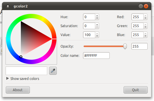
Gcolor2 is an excellent and simple little tool for web designers and developers running Linux. It has a dropper that can select a color from anywhere on screen and it describes each color in hexadecimal as well as HSV and RGB parameters. You can even keep a list of saved colors if would like.

However, the one shortcoming of the application is its bronze-age icon. It looks like it would be right at home on any ’90s-era desktop. See for yourself:

Needless to say, it looks awkward in the context of any contemporary desktop. It also lacks a nice clean edge, giving it jagged silhouette.  For this reason I opened up  Inkscape one night and created a new icon for Gcolor2. I really think the “drawn with a crayon” look was a ’90s style, so I abandoned that approach and recreated the tri-color cube as a more contemporary and clean-edged glowing box:

I think this a good solution. It’s not a complete departure from the original design but it is a refresh that will hopefully look great on the latest desktop systems. I have tried to submit it to the Gcolor2 project, but there hasn’t been an update since 2005 and none of the developers seem to have time to respond to my proposed new artwork. Today I submitted a patch and included the new artwork as a PNG and SVG files. You can certainly go there to get them, but you can also download the files here if you’d like to update your own desktop:

Download my 2010 version of the Gcolor2 icon as SVG

Another great application for working with colors in Linux is called Agave. It generates color schemes based on various color relationships like complementary, triadic, tetradic and analogous. Just give it one color and it will give you other colors according to the relationship type you specify. Fortunately it already has a very nice icon!

Add Bulk File Renaming to Apple’s OSX Finder.app

Today at work I was asked how to rename multiple JPEG files on a Mac. This individual was apparently able to accomplish this amazing feet with very little effort on a Windows system. (Every time I hear someone say how easy Windows makes something my stomach turns.) I used to have an AppleScript that did just that, but I have since lost track of that file. So I looked to the internet. Surely it’ll only take a few minutes to make this happen, right?

There is one free application available for renaming files (NameChanger) and there are several tutorials about using AppleScript and/or Automator.app. The DIY script and Automator options are okay for certain types of people, but the people that really need help will struggle to understand how to use these tools. What are all of the non-geek OSX users supposed to do?

Well, here’s another one of my small contributions to society. A free Automator.app-created workflow that will add the option ‘Rename Multiple Files’ to the contextual menu in Finder.app. Just select multiple files, right-click and select ‘Rename Multiple Files’ and away you go!

Here’s how to install this Rename Multiple Files tool:

  1. In the Finder navigate to /Users/yourname/Library/Services/
    [if “Services” doesn’t exist, create a new folder and name it likewise]
  2. Download the RenameMultipleFiles.zip, extract the contents onto your desktop (double-click in OSX)  and copy the file “Rename Multiple Files.workflow” to the previously mentioned “Services” folder.
  3. Open a Finder window with multiple files. Select all of the files. Right-click on the selected files. At the bottom of the contextual menu you will find an option titled “Rename Multiple Files”. (It may take a minute or two for this new option to become available on your contextual menu.)

Shortly after you click on “Rename Multiple Files” you will be presented with a small window and several options. To save a verbose explanation I have included screenshots of the options below.

This workflow was created on a Mac running OSX 10.6. It is dependent on Automator.app. It definitely works with other 10.6 machines, but if you are running some other version of OSX it may or may not work.

Please give me feedback about whether or not this is useful or if it doesn’t work at all. Thanks.

Lenovo G530 Touchpad (Trackpad) Disabled

Recently my wife was using my Lenovo G530 (running Ubuntu Linux) in the living room and somehow managed to disable the trackpad. She could not recall pressing anything unusual. This particular laptop has a little blue light that glows in between the two trackpad buttons with an icon indicating that the light means that the touchpad was disabled. Great, so the built-in feedback that the laptop had was working correctly, but how did we get the laptop in this state? At the time we had a friend over, so I just pulled out a spare mouse rather than attempt to solve the problem.

The next morning I expected that, upon restarting the laptop, the trackpad would be functioning correctly. There are many bugs in the computer world that can be resolved with a system restart. But that didn’t work this time. The touchpad continued to have no influence over the cursor on the screen.

I then proceeded to search the web for more information about this touchpad-disabling bug either associated to the Lenovo G530, to the particular version of Ubuntu that I was running or to a combination of the two. I found several listings but they mostly had to do with the touchpad being completely unavailable after a recent operating system install or upgrade. My touchpad had worked perfectly including horizontal and vertical scrolling until this recent change.

Well, after an hour or so of casually poking around the internet I discovered an important, but rarely noticed touch-sensitive button next to some touch-sensitive volume controls that I almost never use:

Sure enough, touching that quasi-button re-enabled the touchpad. My wife had apparently touched it accidentally when trying to increase the volume. All I could do was laugh at my stupidity. And be a bit delighted that Linux so completely supports the hardware on my laptop.

HTML Character Chart Update: Sound Recording Copyright Symbol

Sound Recording (Phonogram) Copyright Symbol

A friend was looking for the circle-P character to include on the jacket design for a musical recording. I was surprised to discover a glyph/character that I wasn’t aware of. We weren’t even sure what this symbol meant in relation to the copyright symbol. Turns out this symbol, the Phonogram Copyright Symbol or Sound Recording Copyright Symbol, protects the copyright of the sound recording itself as something separate from the written music and lyrics. Good things to know!

Regardless, this character can now be found in my ever-growing HTML Character Code tool. Enjoy!

Just Started Running BOINC!

I’ve been running my Debian Linux (PowerMac G4 780 MHz) file server for almost a year now. Aside from a recent near-suffocation from cat hair it has had no problems. When we’re going to be out of town I shut it down, but otherwise it runs all the time. We haven’t really noticed the addition to our power bill and in the winter it just contributes to the in-home heating, so it’s not a big deal. Especially considering that I got this machine for little or nothing.

It’s pretty nice being able to jump from my desktop to my laptop without missing a beat when working on various projects or to listen to my entire music collection from anywhere in my home. It’s also very satisfying to have a weekly automated backup to a secondary drive for all of my files. I don’t have an off-site backup solution yet, but at least I’m prepared for hardware failure.

Better late than never, but I finally got around to setting up BOINC on this server.BOINC is “Open-source software for volunteer computing and grid computing.” Basically, it turns lots of individual computers into one effective super computer. The main goal behind this software is to allow individuals to help under-budgeted research projects by allowing them to use their idle computers to process computations.

Since my PowerMac G4 spends most of its time twiddling its thumbs I thought it would be good to give it something constructive to do. In this case I have set it to help with the Rosetta@Home project:

Rosetta@home needs your help to determine the 3-dimensional shapes of proteins in research that may ultimately lead to finding cures for some major human diseases. By running the Rosetta program on your computer while you don’t need it you will help us speed up and extend our research in ways we couldn’t possibly attempt without your help. You will also be helping our efforts at designing new proteins to fight diseases such as HIV, Malaria, Cancer, and Alzheimer’s.

It sounds like a pretty good thing to provide assistance to. I’ll report back once my server has actually completed some work and registered on the project’s meters.

HTML Character Chart Update: Polish Alphabet

While working on an upcoming new website for Gramps (Free Open Source Genealogical Research tool that I contribute to) I am learning the challenges of developing a multilingual international website. In working with some translations I discovered that my character chart did not include characters from the Polish alphabet!

Needless to say, my character chart now includes decimal and hexadecimal/Unicode references for the characters in the Polish alphabet.

HTML CHARACTER CODES

Printing Marks in Inkscape

Inkscape Printing Marks Extension Interface and Output

Not sure when this feature was added, but I’m running the Inkscape 0.47 preview and discovered that the default install now includes a “Printing Marks” feature. You can access it from the main menu:

0.47 Extensions > Render > Printing Marks

0.91 Extensions > Render > Layout > Printing Marks

The small options window that pops up allows you to adjust a variety of settings for the position of the marks as well as the type of marks to be displayed, seeming to cover all of the needs of a typical commercial printing process.

PM-MarksPM-Position

The “Live Preview” option makes it easy and efficient to adjust the settings to match your desired output. Once you hit Apply the specified marks are added to your document as vector art in a new, locked layer titled “Printing Marks”.

In the past I’ve manually created crop marks when needed, but this is a major step on the road to serious recognition and use by graphic design professionals. Eventually it would be great to see these options removed to a print and/or export dialog interface, but this is an excellent option to have as well.

Inkscape is an open source and free application built around the SVG recommendation that makes it easy to create vector images. I use it to create illustrations as well as single-page layouts of all sizes. In fact, I recently created a business card layout with Inkscape, exported as PDF and sent to a printer to create offset business cards. The cards turned out great without any problems. A serious vector art tool.

On the Design of Laptops (and my new Lenovo G530 running Ubuntu Linux)

Over the last few months I’ve been shopping for a new/refurbished laptop. I had my mind set on a refurbished Thinkpad R61 or R500, but those were ranging between $600 and $700. At that price I was going to have to wait a while until I had more money set aside. In the meantime I have been looking at every laptop I come across just in case there’s something awesome out there that I have not yet seen.

Earlier this week I was at Best Buy for an unrelated computer project and, on my way out, I swung through the laptop section. After looking everything over it was apparent that anything that was under $500 was crap. However, NONE of the machines were very appealing to me. I know that for a computer I should just be concerned with the performance aspects, but I can’t help but be extremely interested in the overall design of the hardware.

Looking at all of those laptops was disappointing in that aspect. But for Apple and Lenovo, all of the computer manufacturers have apparently decided that all computers must look like some kind of pimped-out Honda Accord. All of them are very glossy plastic and generally covered in distracting ‘designer’ details. The new Dell Studio line is an improvement, but I was underwhelmed by the ‘feel’ of those devices. They felt cheap and bulky and were all priced at the high end. The Sonys look a little better, but not much and they are WAY over priced.

None of these machines resembled the regal designs of Apple or Thinkpad laptops. I know Thinkpads are often considered ugly and bland, but I don’t agree with that. The T-series especially are always very thin with hinges, buttons and levers that intuitively make sense. And the cases always feel very serious and rugged. The Thinkpad is actually better than any Apple laptop in my opinion since it doesn’t allow aesthetics to override functionality. There are plenty of buttons next to the trackpads. The display-latch is not some thin little button that you have to push with your fingernail (Titanium Powerbook).The arrow keys are not scaled down to fit into the overall rectangle of the keyboard.

Speaking of screwed up keyboards, just used a friend’s Dell-AlienWare laptop last night… why would a gamer or anyone that would spend that much money on a laptop want a keyboard that is compromised in any way? For example, the laptop was a 17″ display version with a full number pad but for some reason important keys like the arrow keys, the right-shift key and the question mark/slash key were all micro-sized to fit into a rectangular keyboard outline. It made the keyboard almost unusable. I kept hitting the Shift key instead of the slash-key while typing in URLs. Why would you do that to a premium laptop keyboard? These hardware designers have obviously lost touch with reality. Or maybe gamers really don’t use their computers for anything other than gaming.

After all of this frustration I ended up finding a good laptop at the unbelievable price of $378 on NewEgg.com’s daily specials. I did some quick research and decided to go with it as a compromise to save some money. When the machine arrived two days later I was mostly delighted. What’s the machine? A Lenovo G530. Never heard of it? Neither had I.

Lenoro G530

Apparently Lenovo’s Value Line isn’t very heavily promoted. Also, if you go to their site, the price isn’t much different from their IdeaPad line. The price on NewEgg was pretty spectacular. I knowingly made some compromises, but overall I’m very happy with this new laptop, how it runs and how it looks.

Once you carefully peal off the ‘Intel Dual Pentium Inside’ and ‘Built for Windows Vista’ decals the machine is all black with some subtle gray print and a few blue lights. The only real design misstep is the oversized Lenovo logo on the outside cover. It could have been half the size or maybe even a third. And it’s some kind of metal decal that’s inset into the cover, so you would probably do more  damage than good trying to remove it. Here’s a short list of gripes:

  • The display would be better if it had a latch that held it closed.
  • The oversized exterior Lenovo logo
  • It’s thicker than my Thinkpad T42
  • The exterior cover is a smooth black that shows finger smudges.
  • They could have saved time and forgotten about the touch-sensitive buttons.
  • A middle-button with the trackpad would have been nice.
  • Display is glossy

Here’s a list of nice features:

  • Very quiet
  • Very cool to touch even after long hours of use
  • Touchpad is as good and sensitive as a Thinkpad’s
  • Display is big, sharp and bright
  • Keyboard is great
  • Runs Ubuntu Linux as though it were its intended OS
  • Wireless turn-off switch is handy
  • Exterior looks great
  • Handling/moving laptop build feels strong and well-built
  • Video playback is excellent

And here are the specs:

  • Pentium Dual-Core T4200 — 2 GHz
  • 2 GB of RAM
  • 15″ display — 1280 x 800
  • 150 GB Hard Drive
  • DVD-RW Optical Drive
  • Built-in Webcam
  • Built-in a/b/g Wireless
  • 4 USB ports
  • VGA-out port
  • Ethernet port
  • Modem port
  • Multi-Card Reader
  • Line In jack
  • Headphone jack

This is a good system and great for running Linux. Some of the hardware needs proprietary drivers (wireless) but with Ubuntu getting drivers like that is fairly simple. A great budget machine that, in my opinion, is much better looking and less bulky than most of the ]more expensive models that are on the market currently. If you can find it at the price I got, this is an amazing machine compared to the much smaller and less powerful netbooks that are similarly priced.