Sublime Text 2: Find and Replace with Regular Expressions for Idiots

Preface

Hello there! I am an HTML and CSS expert that also hacks on server-side (PHP) and client-side (JavaScript) scripting languages. I am surprisingly productive at working with these elements even though I do not have a degree in Computer Science.

I like to use Sublime Text 2 – or whatever version – to work on my code. I want to work faster and Sublime Text’s multiple-cursor/multiple-file editing and fancy search tools are like training wheels for a person that never attempted to learn how to use Vi or Emacs.

With all of that out of the way, I’d like to say that REGULAR EXPRESSIONS ARE AWESOME. However, everyone online that tries to explain how to use them seems to think that they are talking to people that already know how to use them. It’s baffling and frustrating when you don’t have the foundation in text editing skills that everyone online assumes is common knowledge. And it’s not like you have to be a wizard to use regular expressions. If you can understand a few basic mechanisms, the rest is just vocabulary.

Find and Replace Basics

Find and Replace is a simple mechanism available in any serious text editor and also word processors and design layout applications.

Find and Replace at its most basic has two fields:

  1. FIND – A set and arrangement of text characters that you are specifically looking for within a defined range of text or a document.
  2. REPLACE – A set and arrangement of text characters with which you want to overwrite the contents of the FIND field.

In Sublime Text 2 there are four buttons associated with the Find and Replace panel:

  1. FIND – Visually highlight the first instance of text that matches the contents of the FIND field.
  2. FIND ALL – Visually highlight all instances of text that match the contents of the FIND field.
  3. REPLACE – Overwrite the first instance of text that matches the contents of the FIND field with the contents of the REPLACE field.
  4. REPLACE ALL – Overwrite all instances of text that match the contents of the FIND field with the contents of the REPLACE field.

In general, I only use REPLACE ALL since Sublime Text 2 pretty much does the FIND ALL functionality automatically as you type into the FIND field.

To bring up the Find and Replace panel, press CMD + Option + F or go the the menu > Find > Replace.

I’m not going to give an example of simple text find and replace. If you understand how CSS styles apply to specific HTML elements by way of element or class names and varying levels of inheritance, you most likely grok how basic find and replace works.

Employing Regular Expressions Within Find and Replace

What I am primarily interested in is leveraging Regular Expressions within the Find and Replace mechanism to achieve magical, time-saving actions.

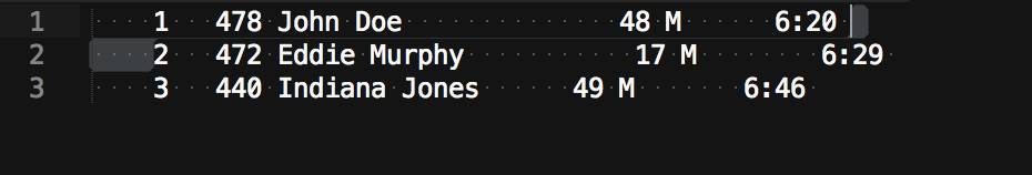
Regular Expressions make it possible to automate what would otherwise be grueling manual-insertion tasks. For example, you need to convert tabulated data from a text file into tabulated data in an HTML table. Usually the only thing separating the values are varying numbers of spaces. Like this:

    1   478 John Doe              48 M      6:20 
    2   472 Eddie Murphy           17 M        6:29 
    3   440 Indiana Jones      49 M       6:46

Basic Find and Replace would work fine in this scenario if a single, unique character were used to separate the different values – like the comma in a comma-delimited/comma-separated file. But when all you have is varying numbers of spaces, a more sophisticated tool like Regular Expressions is needed.

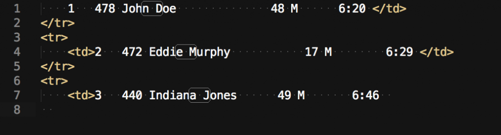
Actually, we could insert the table row and initial table data tags by leveraging the invisible line-break character in the data above. To get the necessary invisible characters use click-and-drag to select the line-break at the end of one line like this:

Screen Shot 2014-08-10 at 4.04.41 PM

and Copy/Paste that into the FIND field. Then, in the REPLACE field type:

</td>
</tr>
<tr>
    <td>

and click REPLACE ALL to get the following:

But after that, we’re looking at a lot of manual select-and-paste work.

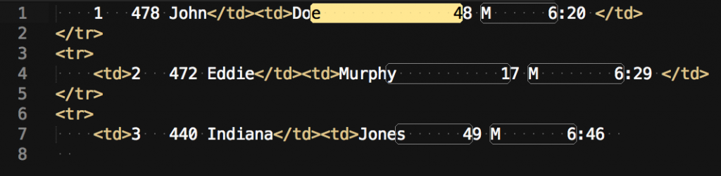
Let’s first use Regular Expressions to isolate the first and last name values. They are unique in this file in that the are two words separated by only one single space.

Screen Shot 2014-08-10 at 5.04.17 PMBefore we start employing Regular Expressions in the Find and Replace panel, we need to enable Regular Expressions by clicking a button by that name, which is the left-most top button in the Find and Replace panel:


With the Regular Expressions mode activated, this is what I put in the FIND field to isolate that space in that particular location:

([a-z]) ([A-Z])

Which should make Sublime Text 2 look like this:

Screen Shot 2014-08-10 at 4.19.31 PM

So, that works in this instance! But why and how? Let’s break it down:

  • [ ]   Whatever expression is inside these brackets will match ONE character.
  • [a-z]   This expression means “ONE character that is any lowercase letter, a through z.”
  • [A-Z]   This expression means “ONE character that is any uppercase letter, A through Z.”
  • The “space” in between these two expressions is a literal “space” character.
  • ( )   Parenthesis surrounding an expression make a “group”. Groups can be referred to by variables. In this case we defined two groups. Without any effort on your part, these groups are numbered, starting with variable “1” on the left-most group and counting upward to the right. This will come in handy when we fill in the REPLACE field.

In summary: The FIND field includes regular expressions that identify any single lowercase letter followed by a space and then any single uppercase letter.

Now, in the REPLACE field I will type the following:

\1</td><td>\2

and after clicking REPLACE ALL will result in the following text:

Screen Shot 2014-08-10 at 4.39.15 PM

That also worked! But why and how? Let’s break it down:

  • \  is the “backslash” character, which “escapes” the character that follows it. I don’t completely understand this usage, but in the case of Sublime Text 2’s REPLACE field this means “leave whatever text that matched our regular expression in the group (identified by it’s variable number) where it was, do not replace”.
  • In this example, we are telling Sublime Text 2 to leave the single lowercase letter associated with the variable “1” where it is, followed by the literal text  “</td><td>” and then leave the single uppercase letter associated with the variable “2” where it is.

The next target is between the Last Name data and the number to the right of it. I will put the following text into the FIND field:

([a-z]) *([0-9])

This actually ends up working better than I had anticipated. It selects the desired text as well as another series of spaces between data points:

Screen Shot 2014-08-10 at 5.12.44 PM

Since the first character is clearly supposed to be “lowercase only,” why is this second space between data points matching our search? Let’s break it down!

  • [a-z]   This expression means “ONE character that is any lowercase letter, a through z.”
  • Turns out I had the  “Case sensitive” feature (right next to the Regular Expressions button) disabled and as a result ignoring the case-sensitive aspects of my regular expressions! 🙂 Happy accident. Just something to be aware of if you are ever seeing confusing results.
  •  *   A literal “space” followed by an asterisk. The asterisk directly following another character means “match 0 or more of the preceding character” so this is quite useful for selecting spaces between data points that are made up of varying numbers of spaces.
  • ([0-9])   This expression means “ONE character that is any integer 0 through 9 (zero through nine).”

Since this lack of case-sensitivity actually worked for me, I went ahead with the same text in the REPLACE field as before and produced this result:

Screen Shot 2014-08-10 at 5.20.07 PM

With those two examples I feel I’ve covered some very useful basics of Regular Expressions within the context of Sublime Text 2’s Find and Replace panel.

A good resource for learning more about regular expressions: http://www.zytrax.com/tech/web/regex.htm#simple


Discovering Clay Shirky via Mr. Alan Cooper Quoting Him On the Perils of Categorizing Things In Advance

I keep wanting to refer back to this truly insightful tweet from Alan Cooper. Twitter is not a great place to keep things that will be useful for a long time. It can be grueling work to find a specific old tweet. As a result, here is the content of his tweet about the challenges of categorizing things in advance for documentation purposes:

“categorizing things in advance forces the categorizer to take on 2 jobs that are quite hard: mind reading, and fortune telling.”

and here is a screenshot of the tweet as well:

Screen Shot 2014-03-30 at 10.34.43 AM

 Thank you Mr. Alan Cooper for this wonderful little statement. As a result of wanting to frequently bring this quote to people’s attention I wanted to post this on my site. And after assembling the above it occurred to me that HE had put this in quotes himself. I didn’t notice that before! This was apparently not an original thought of his own but something somebody else said that he was sharing.

Naturally, the next thing to do was to sick Google on the quote and see what popped up.

Maybe I’m not smart enough to be following Alan Cooper on Twitter since I totally missed that the above tweet was quoting Mr. Clay Shirky from some talks that he gave in 2005 collectively titled, “Ontology is Overrated: Categories, Links, and Tags”. I am guessing these “talks” are well known in certain circles.

I wanted to share this little revelation about discovering the work of Clay Shirky. This is how I have learned throughout my whole life. This is how I know what I know. Looks like I have some reading to do!

Follow these guys on Twitter: @MrAlanCooper and @CShirky

WordPress Multisite and Domain Mapping on 1and1.com Shared Hosting

These are just some notes about how I got WordPress Multisite and Domain Mapping running on a 1and1.com shared hosting account.

WordPress Multisite Setup

  1. Follow instructions on this page: WordPress Codex – Create a Network
  2. If you are planning to map independent domains to the various sites on your network, I recommend using the sub-directories for addresses of network sites. As far as I know, wildcard DNS isn’t an option on 1and1.com shared hosting packages.
  3. Ignore the bit about the WordPress files needing to be installed in the root directory/folder of your hosting file-space. It merely needs to be in the root folder of whatever directory/folder your primary network domain name is assigned to.

WordPress MU Domain Mapping – Installation

  1. Install the WordPress MU Domain Mapping plugin in the usual way.
  2. Once the plugin is installed, some manual configuration is necessary. Follow instructions here: wordpress-mu-domain-mapping/installation/

WordPress MU Domain Mapping – Map Domain Name to Network Site

  1. Create new network-child site (examplenetwork.com/newsite)
  2. Log in to 1and1.com admin > Domains
  3. Click the checkbox of domain name (mynewsite.com) > Destination > Edit Destination
  4. Set “Destination” to “Home Directory”
  5. Set “Home Directory” to the root folder of the network site “/examplenetwork/”
  6. Click OK
  7. Return to examplenetwork.com/wp-admin
  8. Go to the top navigation “My Sites” > “Network Admin” > “Dashboard”
  9. Go to “Settings” > “Domain Mapping”
  10. Set “Server CNAME domain” to “examplenetwork.com”
  11. Under “Domain Options” check
    • Remote Login
    • Permanent Redirect
    • User Domain Mapping Page
    • Redirect administration pages to site’s original domain
  12. Click SAVE
  13. Go to “Sites” > “All Sites”
  14. Hover on “/newsite/” and click “Dashboard”
  15. Go to “Tools” > “Domain Mapping”
  16. Under “Add New Domain” enter “mynewsite.com”
  17. Check “Primary domain for this blog”
  18. Click ADD

NOW SIT BACK AND PATIENTLY WAIT TO SEE IF IT WORKS

Ubuntu Linux with Gnome Shell on Lenovo ThinkPad T530

I recently purchased a Lenovo ThinkPad T530 with the following specs:

  • 15.6″ FHD screen with 1920 x 1080 pixel dimensions (13.5 x 7.75″ physical dimensions)
  • Intel Core i5-3210M CPU @ 2.50GHz
  • Intel HD 4000 Graphics
  • 4 GB RAM (Max is 16 GB!) PC3-12800 DDR3
  • 120 GB SSD
  • Intel Centrino WL-N 2200 (dual-band wifi)
  • 9 cell battery (with WIFI on and dim screen I get about 8+ hours!)
  • Minutiae: backlit keyboard, bluetooth, HD webcam, 90W AC adapter, DVD-R optical drive, 320 GB 7200 HD with Windows 7 installed, I ordered a mini-displayport to HDMI adapter for $5 from Amazon

Though the machine feels pretty light for its size, it is a predictably durable-feeling machine. Very sturdy and the matte black finish is really great. The thing looks awesome once you get all of the stickers off of the palm rest. With the lid closed, the rigid body is comfortable to carry around. A considerable improvement over the squishy Lenovo Essential B570 that it replaced.

As many online reviews have stated, the battery doesn’t seem to latch into the main body in a very satisfying way. When holding the laptop you will notice a bit of play between the battery and laptop body. Not a show stopper by any means. The display hinges are very firm. The screen latches work well but don’t hold the screen as tight as I’d like. Also not a show stopper. Just picking nits.

The new island-style keyboard is just as good or better than the previous ThinkPad keyboard (I had a T42 once upon a time). It looks similar to the keyboard on the Lenovo IdeaPad and Essential laptops, but it feels much more firm and durable – a delightful surprise. I was perfectly happy with the feel of the B570 keyboard, but this ThinkPad keyboard is really awesome. One thing that will take some getting used to is the placement of the FUNCTION and CONTROL keys on the bottom-left of the keyboard. You can flip-flop which is which from the T530 BIOS and I did that which is great. Unfortunately they didn’t make the two keys the exact same size so that you could physically switch the keys to match the BIOS setting. But that’s a pretty nerdy problem to have (#nerdworldproblems).

Since I don’t use Windows, I removed the original HD and put it in a box where it will stay until the day I need to resell the T530. That way a fresh install of Windows 7 will be ready for the new owner, since nobody seems to include actual Windows install discs with these machines anymore. Turns out Lenovo is migrating to the newer 6mm HD form factor. There’s plenty of room for a 9mm drive but my 9mm SSD didn’t fit the rubber sleds that came with the machine. I ordered a 9mm sled from Amazon and installed the SSD without the sleds until that arrived.

Everything works with Ubuntu Linux 12.04. Special buttons for audio volume, screen brightness, play/pause/next/prev, the physical WIFI switch, the touchpad, the trackpoint, all of it. I highly recommend the Intel Centrino WL-N 2200 wifi upgrade. The dual-channel/radio feature (?) is a massive improvement for working over WIFI as opposed to just browsing the web. File transfers across my local network are nice and snappy. Plus there are Linux drivers for it, so no need for “restricted drivers”. It just works.

Contrary to some of the reviews, the speakers are nice though don’t have a lot of bass – is that really surprising though? Sometimes these laptop reviewers… I just don’t know what audience they are talking to. They don’t seem to be focused on what is important to me very often. The number of reviewers that think the Thinkpad hardware design is outdated and ugly are in the majority. They apparently like shiny hardware enough that they can overlook the idiocy of putting a too-small right-SHIFT key next to the UP key.

Linux on the T530 with 15″ FHD Screen

My existing Ubuntu Linux 12.04 system on the SSD had no trouble booting up on the T530. Everything was perfect if you didn’t mind really, really small text and interface elements. Also, the colors are all pretty saturated on this screen. It needs to be calibrated and if you are a graphic designer your tools need to support color management. Luckily, Gnome/Linux, Gimp, Inkscape, Scribus and Firefox all have some pretty good color management features. They are not always completely finished features, but serious work can be done if you know what you are trying to do. If thinking about color management makes your head spin, buy a Mac running OSX and buy Adobe’s Creative Suite.

This screen has an effective screen resolution of 142 PPI. Compare this to the ~210 PPI on the Retina MacBook Pro. And then compare it to the ~100 PPI of most 13/14/15″ laptop displays with 1366 pixels across. In a nut: if you can get your operating system to increase UI text and graphic sizes to the physical size you are used to working with on a 15″ screen you will have the luxury of a very sharp, high-resolution experience. I’ve been able to do just that for the most part, though it is a work in progress. The rest of this post will be a notebook of adjustments and tweaks that I’ve used to make the high resolution experience consistent throughout my Linux system on the T530.

Notes on T530 Linux Configuration

Gnome Text Scaling

Adjust Gnome 3 text scaling to get the Gnome interface to use more appropriately sized text. You will need to install the Gnome Tweak application for this.

Advanced Settings/Gnome Tweak (gnometweak) > Fonts (see screenshot for my settings)

Web Browsers: Default Zoom Value

Adjust web browsers to zoom websites to a default value.

  • Firefox: enter about:config in address bar, search for layout.css.devPixelsPerPx and set the value to your preference. I used 1.5.
  • Chrome/Chromium: Settings > Under the Hood > Web Content > Page zoom: > 150%
  • Opera: Settings > Preferences > Webpages > Page zoom > 150
  • Gnome Web Browser: Not a setting that is available as of version 3.4.1

This also works for Thunderbird! Preferences > Advanced > Config Editor … > search for layout.css.devPixelsPerPx and set to 1.5.

In general, browsing the web like this is a very good experience. Sure, the graphic images are being scaled up in many cases right now, but a lot of responsive sites actually look beautiful and in general everything that is text or drawn with CSS looks gorgeous. Most importantly, the way zooming in browsers works across all contemporary browsers preserves the layout and design of most sites.

Screen Calibration and Color Management

If you are running Ubuntu 12.04 or newer or any Linux with Gnome 3 a program that manages color management and screen calibration should already be installed. Go to System Settings > Color. From this application you can specify color profiles for your various devices: screen, printers, video cameras, any thing that records or displays visual color data can be calibrated and color managed.

The T530 and W530 can be equipped with a built-in display colorimeter. Which is a neat and unique idea, but the device is built in to the palmrest and so will only ever be able to monitor one specific spot on the screen. That and I’m sure the included Windows software does some special maneuvers to work while the laptop’s lid is closed… I figured that probably wouldn’t work under Linux so I didn’t buy it. Plus, I already own a Pantone Huey Pro. Either way, you’ll need some kind of colorimeter to calibrate your screen. If you don’t already own one, I recommend the Hughski ColorHug colorimeter by Richard Hughes, the guy that wrote the color management application for Gnome on Linux (there’s a version for KDE as well). Looks like a great device at a reasonable price.

Firefox Color Management

Even after calibrating my display this FHD screen shows pretty saturated colors in places. The Gnome colord calibration certainly improves the overall color of the screen, especially the white and black points. However, the applications you use also need to be color managed for the best possible experience. This screen seems to have a tendency to over saturate, making the lack of true color management very obvious to a designer like myself.

Fortunately Firefox has some great color management tools built in to the more recent versions. Unfortunately there is a certain amount of overhead involved in correcting colors, so Firefox comes preconfigured to only color manage images that include a color profile. You want to switch it to color manage everything. This can be done via the about:config method, but there’s a nice and simple addon that makes the setting more approachable: Firefox Addon: Color Management

Once its installed go to Tools > Addons > Color Management and set it to “All Images” and then identify your current display profile by using the “browse” feature to navigate to it. You should start seeing a better looking web right away!

Read more about color management in web browsers here: Gary G. Ballard’s Web Browser Color Management Tutorial (note that Firefox does color management the right way: color managing images as well as colors defined in CSS.) Gary G. Ballard is awesome.

Caps Lock / Num Lock Indication

The T530 does not have an LED light that indicates the state of Caps Lock or Num Lock. It’s an odd exclusion since there’s plenty of room next to the WIFI and HD activity lights. But OH WELL, there’s a Gnome Shell Extension called “Lock Keys” that adds a nice and simple indicator in the top panel.

Mouse Cursor Size

Struggling with this a bit right now. I am getting inconsistent results and so am hesitant to even share the tweaks that I’ve made so far. I hope to report back on this with a really good solution. The current state of adjustable mouse cursor sizes on Gnome 3 on Ubuntu 12.04 appears to be a bit of a hacked up mess.

SimpleInvoices: Invoice Template “Nebraska”

As someone who picks up a little freelance here and there, it can be handy to have some software that helps manage invoices and estimates. Software that isn’t Microsoft Excel which, while it will do the work, isn’t great for this purpose. Fortunately I discovered SimpleInvoices, a free and open source web-based invoice management program.

I was a bit disappointed that the default invoice style for SimpleInvoices didn’t resemble the illustration on the SimpleInvoices homepage. And, after seeing that the HTML template for the page was entirely constructed in tables, I went about creating a new, more contemporary HTML invoice template that mimics that template illustrated on the homepage.

(At least, the HTML-based print preview didn’t look that way. Maybe the export to PDF is a different story, but that functionality isn’t available to me.)

Since a template needs a name, I named this invoice template after my home state for now. I’m sure it’s not perfect, but it’s well-suited to my needs. Let me know if there are things that could be improved. You can download the files here:

http://simanek.us/downloads/SimpleInvoices_template_Nebraska_v1.2.zip

Notes:

Installation

  1. Extract files from ZIP archive after downloading the file.
  2. Copy the folder titled “Nebraska” to /templates/invoices in your SimpleInvoices installation.
  3. Log in to your SimpleInvoices program and navigation to Settings > System Preferences and edit the “Default Invoice Template” and select “Nebraska” from the list.
  4. If you have not yet specified your own logo image, upload your logo graphic (for printed and PDF’d invoices I recommend creating your logo in vector art and saving as an SVG file for use with SimpleInvoices) and navigate to People > Billers and click EDIT next to you name. Under “Logo file” you should be able to select your logo graphic.*
  5. Test template by opening an estimate or invoice and clicking the “Print Preview” option. Use your browsers printing functionality to print the invoice or save the output as a PDF.

* In order to use SVG files you will need to edit the following SimpleInvoices file: /include/functions.php – Open in text editor and look for “getLogoList” function and change the following line:

$ext = array("jpg", "png", "jpeg", "gif");

to include “svg”

$ext = array("jpg", "png", "jpeg", "gif","svg");

Save the file and now you can use the SVG version of your logo to get a crisp printed logo or a resolution-independent logo in your PDF file.

Firefox Tricks

There are limitations to relying on printing from web browsers to generate PDFs. One of the big limitations is that in general web browsers don’t print background colors or images. In the case of this template, that affects the gray background in the column heads and the yellow highlight behind the grand total. Fortunately Firefox (there might be other browsers that do this as well) gives the option to enable the printing of background colors and images in the Print dialog options.

The other aspect of printing from web browsers that is problematic is the automatic “Pages 1 of 2” and “the title of this webpage” headers and footers on the resulting print out. Firefox also allows you to customize or even turn these off entirely in the print dialog options. You’ll have to do this to get a good, clean invoice.

Layout

Originally I had tried to accommodate window envelopes by strictly formatting the Biller and Customer information sections. But with snail mail on the decline as a method for delivering invoices, version 1.2 discards that strict positioning in order to create a more flexible, robust and attractive layout.

Drupal Webform Module: How To Customize the Subject Line

I can’t seem to find a lot of documentation on certain Drupal modules. Yet another thing about Drupal that is frustrating, especially considering how much crap people throw at WordPress. WordPress seems to be much more organized and JUST as capable as Drupal. Oh well. Haters gonna hate.

THE FOLLOWING DESCRIBES HOW DRUPAL 6 WORKS.
THIS HAS CHANGED A BIT FOR DRUPAL 7.
(See comments for info about Drupal 7.)

How to customize the subject line in an automated email generated by the Drupal webform module

Sometimes examples save a lot of descriptive verbiage…

field label “First Name” – field key “fname” –
webform email custom subject line “Message from %value[fname]

and

field label “Last Name” – field key “lname” –
webform email custom subject line “Message from Mr. %value[lname]

unless the field in question is contained in a fieldset element! If that’s the case:

field label “First Name” – field key “fname” – fieldset field key “contact_info” –
webform email custom subject line “Message from %value[contact_info][fname]

and then click “Save e-mail settings” and you’re done!

This information was derived from the last comment on this page: http://drupal.org/node/823408 after 45 minutes of looking through a bunch of dead ends. I hope this post is easier to find, digest and get back to what you were doing before you forget why.

Mark Housel asks, “I was wondering if you could tell me just where these few lines go?”

So, the above details do take for granted that you know where the text in question should be input into the Drupal system. I generally try to avoid doing that. So many great how-tos on the web are written by smart people that seem to be talking to other people that already know a great deal about the subject in question. So we should all try to account for folks that are not familiar with certain details.

Mark and anybody else that is a little lost: I assume you know how to create a webform node on your Drupal site. If you click to edit the webform node in question you should see something like this:

  1. From the Webform node > edit window, click the “Webform” tab (see A)
  2. Click on the “E-mails” sub-tab (or section … whatever you want to call it … see B)
  3. If there is an existing E-mail output setup, click “Edit”. If one does not exist click “Add”

Following steps 1 thru 3 will bring you to the following page:

Scroll down to the “E-mail header details” and the “E-mail subject > Custom”. This is the input that I am referring to above. Enter what you need to there to alter the subject line of the automated email output.

Let me know if there are any other questions.

Introducing the Heads-Up Grid

As a web designer and developer I use many tools to help me design and build a website. The initial design ideas are worked out on paper and within some kind of WYSIWYG graphics editor like Photoshop, Illustrator, Gimp or Inkscape.


Since reading Khoi Vinh’s Ordering Disorder: Grid Principles for Web Design I’ve been using grids – mostly just columns, really – to bring greater order to my designs. So far this new approach has been fruitful. A helpful tool in this regard is The Gridulator, which makes it easy to determine the dimensions of your grid and also download a graphic representation of the grid that you can use as an overlay in the above mentioned graphics programs while you are working out the details of a site design.

However, even if my idea is pretty nailed down in the sketching and graphic-editor stage, the act of actually building the site with HTML + CSS always presents new problems and solutions. Part of this is due to my clients not providing all of their content (or even knowing what it will be) until I’m at that stage. Another part of it is that laying out website designs in a static graphic state makes it easy to overlook some aspects of the site.

For these reasons and others I find myself doing a lot of actual designing from within the browser, either via Firebug or just a lot of trial and error with different properties in the code. Page structures in HTML + CSS can get complex fast and it can be tricky to stick to your grid if you aren’t always keeping it in mind. It would be helpful to have an easy way to overlay your grid over the web pages as they are built, adjusting the CSS properties until they are absolutely perfect. Or at least pretty damn close!

One recent weekend I had a freelance project that I wanted to avoid and so I determined that I would focus on this grid overlay problem and see if I could build it better and smarter. Figuring out this grid problem was a lot more important than working on a project that I would get paid to work on. I’m sure you can relate to the wacked-out sense of logic that leads to such decisions.

The result of that ridiculous procrastination was the initial version of what I am calling The Heads-Up Grid. It was actually looking good enough to share with others at that point. A friend suggested I post it on Hacker News to see if anybody would find it interesting. I did just that and got one comment from somebody that suggested I use JavaScript to generate the HTML elements, simplifying the necessary setup to get the grid working. They even gave me a bit of code to show how easy it is to do that with jquery. Once I saw that and understood how it worked, I really went to town!

The somewhat-final result is a fairly easy-to-use web page grid overlay. It has some nice features:

  • simple settings
  • vertical grid with columns and gutters
  • horizontal or baseline grid that can be vertically adjusted
  • on/off button displayed in top-right corner
  • set grid to be on or off on page load


Please give The Heads-Up Grid a try. I hope you find it useful. I would love to hear feedback about it being useful or if you have some ideas about how it could be better.

Individual Facebook Like Buttons for Images with NextGEN Gallery

Because I think this is probably of interest to some people but I don’t have a lot of ambition to write about it, I will present these instructions as concisely as possible:

  1. Have a WordPress website up and running
  2. Install the NextGen Gallery plugin
  3. Install FancyBox the old fashioned way or as a plugin
  4. Read this post about Facebook Open Graph WordPress Integration to learn about adding proper Open Graph meta elements to the header of your site.
  5. From your WordPress admin pages go to Gallery > Options > Effects
    1. JavaScript Thumbnail Effect: Custom
    2. Link code line: rel=”gallery”
  6. Then go to Gallery > Options > General Options
    1. Activate Permalinks: YES and define a slug.
  7. Then go to Gallery > Options > Gallery
    1. Show ImageBrowser: YES

The trick with getting NextGEN Gallery to both display your image galleries large images as FancyBox overlays and create unique pages with URLs to display each individual image is to enable the ImageBrowser mode but then alter NextGEN Gallery.php template so that the FancyBox (or other overlay solution) code is used regardless of the “Show ImageBrowser” setting.

With the above settings in place, backup a copy of the NextGEN gallery plugin files from your web server.

/wp-content/plugins/nextgen-gallery/

Then navigate to following file and open it with your favorite text editor.

[YourDesktop or wherever]/nextgen-gallery/view/gallery.php

Scroll down to the part where it says “Thumbnails” in comments. This is the loop that outputs the thumbnail grid that displays your embedded NGG gallery on the page. Find the line below:

<a href="<?php echo $image->imageURL ?>" title="<?php echo $image->description ?>"
<?php echo $image->thumbcode ?> >

and change it to:

<a href="<?php echo $image->imageURL ?>" title="&lt;div style=&quot;float:left;
width:70px;&quot;&gt;&lt;iframe src=&quot;http://www.facebook.com/plugins/like.php?
app_id=YOUAPPIDNUMBERHERE&amp;amp;href=<?php echo urlencode(get_permalink()) ?>%2F
YOURGALLERYSLUGHERE%2Fimage%2F<?php echo urlencode($image->image_slug) ?>&amp;amp;
send=false&amp;amp;layout=box_count&amp;amp;width=50&amp;amp;show_faces=true&amp;amp;
action=like&amp;amp;colorscheme=light&amp;amp;font&amp;amp;height=60&quot; scrolling=
&quot;no&quot; frameborder=&quot;0&quot; style=&quot;border:none; overflow:hidden;
width:70px; height:60px;&quot; allowTransparency=&quot;true&quot;&gt;&lt;/iframe&gt;
&lt;/div&gt;" <?php echo $image->thumbcode ?>  rel="gallery">

Save gallery.php and upload to your webserver. If you have the OpenGraph meta elements in place you should now be able to navigate to a NextGEN Gallery on your site, click on a thumbnail and see something like this (right):

This is an individual Like button, allowing your visitors to “Like” specific images within a gallery. Now, it doesn’t work perfectly. Even though you are linking the Like button to a URL that is specific to that image, in my experience Facebook still grabs the first image from that gallery for the thumbnail displayed on the individual’s Facebook Wall. And it seems like the link from Facebook will take visitors to the gallery page of the specific image. Again, this is odd and shouldn’t be, but Facebook is doing a lot of magic here, so who knows why it isn’t working perfectly. The important thing is:

  1. Your visitors can Like individual images.
  2. If visitors see a link to your image on Facebook, clicking the link will take them to the gallery that contains the image in question.

If you get this successfully working to fulfill your needs, be sure to keep a backup of your gallery.php file. Every time the NextGen Gallery plugin is updated this file will most likely get overwritten.

Make WordPress Admin Bar a Sidebar

Fig. 1: Default WordPress Admin Bar

At least since WordPress released version 3 of its open source website CMS it has included a new feature called the “Admin Bar”. This Admin Bar is a menu bar displayed at the top of your WordPress site’s public-facing pages when you are logged in to your site. It is a handy way to move back-and-forth between your public pages and your site administration pages. (see fig. 1)

Sometimes this isn’t a good solution. Especially if the navigation on the public site is at the top of the page with fixed positioning. In that case the admin bar lays over the site’s actual navigation, making impossible to use while logged in.

Fig. 2: Example of Admin Bar as a Sidebar

I haven’t seen a lot of discussion online about how to customize this without installing another plugin. After attempting some tweaks by manipulating the CSS with Firebug it became apparent that this Admin Bar could easily be styled by simply adding CSS rules that apply to the end of your theme’s stylesheet.

On a recent project I developed some CSS style rules to add to your site theme’s style.css file. These styles will transform the long, horizontal admin bar into tall sidebar. This probably won’t work for a 1024px-wide screen, but for many widescreen laptops and displays this should work well.

It still has the default WordPress admin look so I figured this little bit of CSS might be helpful to others. Below is the CSS that I used to make the Admin Bar appear as it does in fig. 2.

/* WordPress Admin Bar Styles */
div#wpadminbar {
    width:120px;
    min-width:120px;
    height:100%;
    background:url('/wp-admin/images/menu-shadow.png') repeat-y top right #737373;
    border-right:solid 1px #999;
}
div#wpadminbar ul li {
    width:100%;
}
div#wpadminbar .quicklinks > ul > li > a {
    border-width:0 0 1px 0;
}
div#wpadminbar .quicklinks li#wp-admin-bar-my-account-with-avatar ul,
div#wpadminbar ul li.menupop ul {
    z-index:1000;
    margin-top:-28px;
    left:114px;
}
#wpadminbar .quicklinks .menupop ul {
    border-top:1px solid #DFDFDF;
}
div#wpadminbar div#adminbarsearch-wrap {
    display:none;
}

I make no guarantees, but do let me know if this worked for you or if you see any problem areas.

Great New Book Coming Soon: “Design for Hackers”

Please consider signing up for email updates for this great new book that is intended to help “hackers” learn the basics of design. It’s being written by a very skillful (and good-looking!) designer named David Kadavy. The book will be available September 2011 and the publisher, Wiley, has recently made the book’s website live: designforhackers.com.

The cover design looks AWESOME.

Set a Custom Starting Point for a YouTube Video

I’ve been embedding videos from a variety of services into web pages for several years now. At the most basic, these services will allow you to embed a smaller version of the parent video. YouTube gives you the ability to adjust the display size and video player color scheme as well as some other interface options. Hulu is unique (as far as I know) in providing users with an easy-to-use custom clipping interface, allowing you to embed only a part of a selected video. I’ve gotten so comfortable with that feature that I’ve been hoping YouTube would introduce something similar.

Well, there’s good news. It’s not as slick as Hulu, but YouTube does provide some options on their embedded player. Most importantly there’s an option to specify a custom starting point for any embedded video. Here’s the parameter:

start

You can use this parameter by adding it to the source URLs in the provided embed code. For example, if I wanted to start my embedded video at the 1:12 mark, the YouTube embed code would look like this:


<object width="656" height="517"><param name="movie" value="http://www.youtube.com/v/tqXJzZ_T8kg?fs=1&amp;hl=en_US&amp;rel=0&amp;start=72"></param><param name="allowFullScreen" value="true"></param><param name="allowscriptaccess" value="always"></param><embed src="http://www.youtube.com/v/tqXJzZ_T8kg?fs=1&amp;hl=en_US&amp;rel=0&amp;start=72" type="application/x-shockwave-flash" allowscriptaccess="always" allowfullscreen="true" width="656" height="517"></embed></object>

And the result will be the following:

You’re welcome!

Why GIMP Is NOT Inadequate

Troy Sobotka, who appears to be a very accomplished commercial artist working in video, illustration and photography, made a relatively brief list of problem areas for Gimp on his blog: http://troy-sobotka.blogspot.com/2011/01/why-gimp-is-inadequate.html

He makes some good points, but the last half of his post is a lot of alarmist speculation. The obvious answer to improving Gimp is to contribute to its development. Complaints about difficult developers sounds like a bunch of complaining. With any open source project you have to earn the respect of the senior developers through consistent work, usually the not-so-exciting kind. With any open source project there are more users than developers and certainly more users suggesting ideas than making any attempt to squash bugs, write documentation or provide objective and helpful feedback. Opinions and assholes.

Anyway, I left a LONG comment today and wanted to duplicate that comment here. The only thing I should have added is a need for Gimp to continue improving color management and that’s why I just said it. Anyway, here’s my comment:

I’m a professional graphic designer. I use Photoshop and Gimp at a very high level of proficiency. Just to point out where I’m coming from. I like Pshop and Gimp for their different strengths, but some of the above arguments are wrong. Gimp certainly has room for improvement, but anyone that actually used Photoshop in 1996 knows that Pshop itself has come a LONG way in 15 years.

I would like to point out something that needs to be understood about the importance of bit-depth. I am constantly working with hi-res jpegs from a wide variety of professional photographers every day. You know how many of those files use 32 bits/channel? None. You know how many of those files use 16 bits/channel? None. They are ALL in 8 bits/channel. It’s certainly great to have the higher bit-depth options, but the importance of that capability in terms of graphic design/manipulating images for press is greatly exaggerated.

Also, CMYK color space in Photoshop is misused by graphic designers because most of them know very little about color space and/or color management. Some of us know (I don’t mean to offend anyone) but the majority of designers I have worked with are completely oblivious. I’ve even seen creative directors explicitly instruct their designers to select “discard color profile” when confronted with the “What should I do?” dialog in Photoshop. The need for CMYK color space, though useful and great, is also greatly exaggerated.

I also think the complaints about the UX are very subjective and usually only illustrate how little effort the commenter put into learning about and using the Gimp.

Two things that would greatly improve Gimp and many people’s impressions of Gimp are:

  • better image scaling/anti-aliasing algorithms
  • layer groups and layer styles

Those two things are certainly complex, but if they were implemented, and it sounds like they will be soon, I would be extremely satisfied with Gimp’s capabilities.

I think it’s healthy to critique software, but the Gimp rarely receives praise for its remarkable capabilities.

New Gcolor2 Icon Art

As a web designer I find application-independent color picking tools extremely useful. I am often working with an array of applications simultaneously and the color I want to identify/dissect/define can be present anywhere on my screen. Being tied to the color picker from either Photoshop or Gimp is very limiting. Usually their “dropper” tool will only work within their own environments and windows. This makes identifying colors that appear on websites impossible without a standalone color picking application (unless you use something like firebug to see the color’s identity in the sourcecode/dom).

Gcolor2 is an excellent and simple little tool for web designers and developers running Linux. It has a dropper that can select a color from anywhere on screen and it describes each color in hexadecimal as well as HSV and RGB parameters. You can even keep a list of saved colors if would like.

However, the one shortcoming of the application is its bronze-age icon. It looks like it would be right at home on any ’90s-era desktop. See for yourself:

Needless to say, it looks awkward in the context of any contemporary desktop. It also lacks a nice clean edge, giving it jagged silhouette.  For this reason I opened up  Inkscape one night and created a new icon for Gcolor2. I really think the “drawn with a crayon” look was a ’90s style, so I abandoned that approach and recreated the tri-color cube as a more contemporary and clean-edged glowing box:

I think this a good solution. It’s not a complete departure from the original design but it is a refresh that will hopefully look great on the latest desktop systems. I have tried to submit it to the Gcolor2 project, but there hasn’t been an update since 2005 and none of the developers seem to have time to respond to my proposed new artwork. Today I submitted a patch and included the new artwork as a PNG and SVG files. You can certainly go there to get them, but you can also download the files here if you’d like to update your own desktop:

Download my 2010 version of the Gcolor2 icon as SVG

Another great application for working with colors in Linux is called Agave. It generates color schemes based on various color relationships like complementary, triadic, tetradic and analogous. Just give it one color and it will give you other colors according to the relationship type you specify. Fortunately it already has a very nice icon!

HTML Character Chart Update: Sound Recording Copyright Symbol

Sound Recording (Phonogram) Copyright Symbol

A friend was looking for the circle-P character to include on the jacket design for a musical recording. I was surprised to discover a glyph/character that I wasn’t aware of. We weren’t even sure what this symbol meant in relation to the copyright symbol. Turns out this symbol, the Phonogram Copyright Symbol or Sound Recording Copyright Symbol, protects the copyright of the sound recording itself as something separate from the written music and lyrics. Good things to know!

Regardless, this character can now be found in my ever-growing HTML Character Code tool. Enjoy!

HTML Character Chart Update: Polish Alphabet

While working on an upcoming new website for Gramps (Free Open Source Genealogical Research tool that I contribute to) I am learning the challenges of developing a multilingual international website. In working with some translations I discovered that my character chart did not include characters from the Polish alphabet!

Needless to say, my character chart now includes decimal and hexadecimal/Unicode references for the characters in the Polish alphabet.

HTML CHARACTER CODES

Custom Google Maps To Display Store Locations

As the Web Producer/Designer at Country Weekly Magazine’s website I am proud to announce a new feature that will make it easier for people to find our magazine in stores. I was able to create this tool thanks to Google’s excellent generosity. You can see this new tool in action here: www.countryweekly.com/where2buy

If you haven’t already created your own custom Google Map, here are some resources that might be helpful. After figuring it out, it’s not too difficult and once in place it’s easy for others to update the locations.

How It Works

There are two components:

  1. the code on your site that defines how and where the Google Map is displayed
  2. a Google Doc spreadsheet containing a list of locations

In order for these two components to correctly produce a map similar to the one shown above you will need the following:

  1. Google Account to create the necessary Google Doc spreadsheet
  2. Google Maps API Key

Signing up for a Google Account is simple and you can get a Google Maps API Key at code.google.com/apis/maps/signup.html. There is also an excellent resource for general info about everything Google Map API at code.google.com/apis/maps/documentation/staticmaps/. However, there’s a lot of information there you don’t really need.

How It’s Done

  1. Build a spreadsheet with the desired marker locations. It can have columns similar to this, but you can name them however: rank, title, address, city, state, zip, description
  2. Geocode every location. Geocoding a location means providing a latitude and longitude, an exact global location, for each marker on the map. You can do this manually by finding the lat/long for a handful of locations with Google Earth. You can also use a free or paid service to automatically geocode your locations based on their street address. Here’s one of those free resources: www.batchgeocode.com. Just paste a tab-delimited version of your location list in, process, and then copy/paste their tab-delimited output back into your file.
  3. Copy your geocoded location list into a Google Docs spreadsheet and save.
  4. Share the location spreadsheet from Google Docs by having it open and clicking the ‘Share’ button and then ‘Publish’ the document. After the doc has been published Google will give you a URL where anybody can see this content. Toward the end of the URL it will say ‘key=’. Everything that follows that is your spreadsheet’s unique key. Save that key for later.
  5. Request a Google Maps API Key for the URL under which your map will appear on your site. Save that key for later.
  6. Go to the Create a Map from a Published Google Spreadsheet page. This page explains a lot on its own. It does a good job of bridging all of this technology and makes it apparent how simple it is to make this work. Everything I have helped you set up should fall into place as you follow the instructions on the Create a Map page.
  7. Paste the output of the Create a Map page into your webpage. Be sure to replace the example Google Maps API Key with your own. Without it your map will appear but your locations will not.

Once you have it up and running you can tweak the default location and zoom of the map and add some other cool features.

Tweaking: Set Default Location and Zoom

By default the Create a Map page sets the default location so that it contains your defined markers. Sometimes you want to specifically define the default location. In the generated code look for the following cluster:

cm_map = new GMap2(document.getElementById("cm_map"));
cm_map.addControl(new GLargeMapControl());
cm_map.addControl(new GMapTypeControl());
cm_map.setCenter(new GLatLng( 43.907787,-79.359741), 2);

Update the cm_map.setCenter(); bit to look like this:

/* Set default map position and zoom here. */
cm_map.setCenter(new GLatLng(41.500000,-99.600000), 7);

This makes it easier to find for future changes. To adjust geocode center of your map, adjust the numbers. The three numbers listed there are:

  1. Latitude
  2. Longitude
  3. Zoom

The zoom value seems to correspond to the ‘notches’ on the visual zoom tool that sits at the top-left corner of most Google Map implementations.

Tweaking: Enable Mouse Wheel Zoom Control

One of my favorite features of Google Maps is that you can zoom in and out of the map with your mouse scroll wheel. This isn’t enabled by default from the Create a Map page. It’s easy to add though. In the same cluster of code shown above add the following statement:

cm_map.enableScrollWheelZoom();

Summary

So that’s it in a nutshell. I hope this helps more people take advantage of the wealth of free tools that Google has made available by way of using standard HTML, CSS and JavaScript. It’s very cool stuff!

Review of GIMP 2.6 on Ars Technica, Bonus: A Link to Yours Truly

Dave Girard from Ars Technica has written a very realistic and thorough review of the GIMP 2.6.4 “Suite freedom: a review of GIMP 2.6.4”. It’s a couple of pages long, but any graphic designers out there that are pirating Photoshop for their home computers should take a look. It’s refreshing to see a designer’s perspective on the GIMP after actually using it.

My only gripe is his comment on GIMP’s image slicing capabilities. He sort of makes it sound like state-of-the-art web designers are still routinely slicing their raster image layouts into pieces to be reassembled in HTML <tables>.

The only time I use that technique now is for the backwards medium of HTML emails. Never mind the importance of meaningful, semantic markup, but with the prominent support of CSS in modern browsers (and even Internet Explorer 6), slicing images like this, though it is a nice feature, isn’t all that important. It wouldn’t hurt to have Photoshop’s functionality, but it’s not a deal-breaker.

BONUS

On the last page of the review I was delighted to see a link to my how-to “X11: Switch Control Key To Apple/Command Key” as a clever hack to switch the X11 modifier key from Control to Command for Mac OSX users. I’m pretty stoked!

1and1 Webmail Sucks

Dear 1and1,

I frequently defend the quality of services that you provide. You have a lot of enemies out there, but my experience has been positive. Your management tools are very simple and intuitive, especially when compared to GoDaddy (I don’t know WHAT is going on with their admin tools, but they’re getting better.).

Even your mail service is top notch. When using email clients, I rarely have problems receiving or sending emails. Good stuff.

However, I have recently been forced to use your Webmail service when away from home and it is a horrible experience. Why?

  1. Webmail login page does not have a simple URL that is easy to remember
  2. Interface is sluggish
  3. The plain text writing tool: cursor falls behind/gets out of sync with typing
  4. Webmail service is frequently unavailable

Otherwise, with the address book, other features and the overall design, your webmail could be a great product. These four issues (and I’m sure there could be more) diminish any other positives. If you could address the service availability at the very least it would be much appreciated. Thanks.

Sincerely,

Jason Simanek

Dean Allen and Textism

I have recently discovered a great blog by a designer that is smart and funny. Today I decided to Google his name and found a great article that he wrote for a list apart about being a good designer:

Reading Design

and at the bottom of that article his short bio states that he is the creator of Textpattern, a website CMS that I’ve been learning to develop with recently.

I love discovering that two people I find interesting are actually one person.

Designing Around WordPress

If you haven’t noticed, I’m doing something really stupid: I’m learning about WordPress Templates by way of making changes to my live site. It’s interesting how they built the Kubrick template. It’s probably very brilliant in its way of dealing with qualities of CSS. However, as an example to learn from, it has a lot of idiosyncrasies.

So far, I feel like this isn’t a bad night’s work in adapting an existing style from a ground-up site to a WordPress template. I hope the site remains to be usable during this transition period.